Tuesday, 22 November 2011

Film Trailer: Final Draft Editing Process

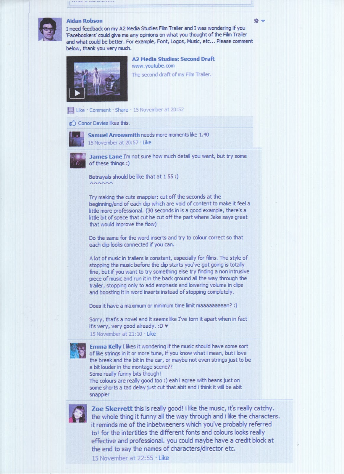
Stage 1 - Importing Re-drafted Logos


Firstly, I went into 'File' and pressed 'Import' then 'Files...'.


This allowed me too click on the Logo I wanted and then press 'Choose'.


Stage 2 - Animating Logo 1


Firstly, I put 'Key Frames' (The Little Diamond Sign) in the timeline underneath the 'Motion' tab, then 'Distort' tab.


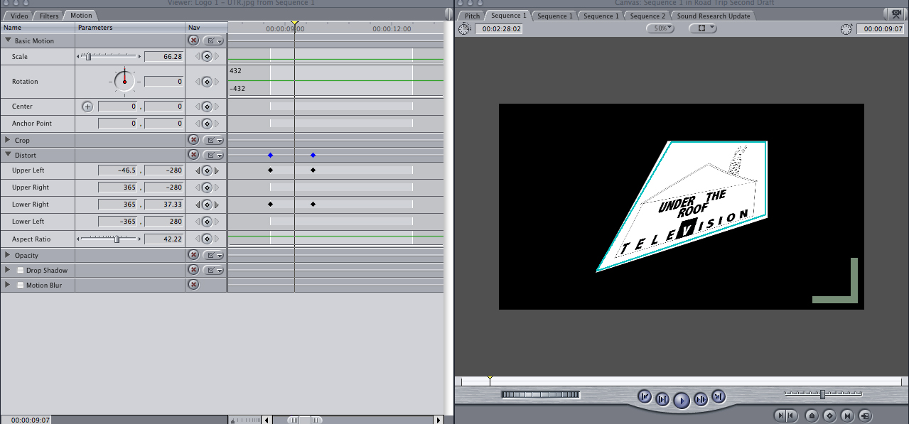
I changed the normal measurements of the corners at different 'Key Frames' so that the image distorted and appeared interesting.


Finally, to let the logo resume it's normal appearance, I set the measurement back to their normal measurements on the last 'Key Frame' so that everything worked smoothly. 


Stage 3 - Animating Logo 2


Similar to Logo 1, I changed the natural measurements
 of Logo 2 at different 'Key Frames' so that the logo appeared to be moving. 


Although, I was using 'Distort' again, I latered the aspect ratio so that the image appeared to be stretched and different to logo 1.


Lastly, in order to let the Logo resume it's normal appearance, I kept the 'Aspect Ratio' the same as it always was on the last 'Key Frame' so that it would stretch from nothing, to it's normal appearance in a short period of time.


Stage 4 - Animating Intertitles


Aniamting intertitles was no different to the logo. However, after clicking on ' Motion' I set the different  'Key Frames' underneath 'Scale'.


As I went along the timeline' I changed the 'Scale' of the text so that it appeared to be flying towards the screen.


Lastly, similar to the logos, I returned the scale to it's normal size of '100' on the last 'Key Frame' in order to let it appear in it's largest size.


Stage 5 - Making the Logos Transparent


During this process, I decreased the fill of the logo  by clicking on the 'Fill' tool and changed it from '100% - 0%'. It then appeared in White and not it's normal colour, Blue.


I then reintroduced the text by pressing on the little 'Eye' sign.


After that, it was just a matter of dragging it onto the credits image and altering the size with the 'Transform' tool.


Stage 6 - Colour Corrector


Here, I went to the 'Effects' tab and dragged 'Colour Corrector' onto the footage I wanted to edit on the timeline.


This then allowed me to open the tab 'Colour Correcter' and alter the Blacks, Whites, Mids, etc, freely.


On this image you can see that  have altered them in order to make the footage brighter and more effective.


Film Trailer: Audience Feedback from Facebook

In Class


Facebook


Re-Drafting Logos

LOGO 1

Stage 1 - Deleting Background


To delete my background, I clicked on the layer named 'Background' and used the 'Delete' tool. After that, it was only a matter of confirming the deleting.


LOGO 2

Stage 1 - Deleting Background

Similar to the first logo, I deleted the bakground layer so that the white canvas would dissappear.

Stage 2 - Creating a Stroke

I decided to give my logo a greater 'Stroke Effect' so that it appeared stronger and had greater emphasis. To do this, I pressed on the 'Fx' tool and clicked on 'Stroke'. This allowed me to change the size to a greater number.


Stage 3 - Editing Font

I decided the font wasn't what I wanted. Therefore, I changed the font to 'GROBOLD', a font I downloaded in my font research. This then shows evidence that the logos have adapted to my film, similar to what real films do too.

Stage 4 - Re-arranging Font


Finally, it was just a matter of re-arranging the fonts with the 'Selction' tool so that it appeared symetracel and well thought out.


FINISHED LOGOS

Logo 1
Nothing has really changed on this logo, just the canvas. Therefore, this will appear more effective in my Film Trailer.


Logo 2
Logo 2 had a few changes. For instance, I wasn't happy with the fonts used. Instead, I changed the fonts and emphasised the outline of the image with a 'Stroke' so that it had greater purpose. I also feel that the fonts used create a greater sense of continuity because the text 'Film Studios' is the same font I used in my font researhc anotehr products. Overall, I am happy with the logos now, and feel they will play a significant part in my final products.


Film Magazine: Final Draft

Film Magazine: Final Draft Editing Process

Stage 1.1 - Finding a Barcode

Firstly, I went onto http://www.google.co.uk/ and I searched 'Barcodes'.


Stage 1.2 - Saving the Barcode Image

Here is one of the result that I clicked on. This made it a large image so that I right Clicked and pressed, 'Save Image As...'.


Stage 1.3 - Opening the Barcode Image in Photoshop

After the image was saved as already a 'JPEG', I could open it inside Photoshop.


Stage 1.4 - Magazine with Barcode


Here you can see that I have copied the image onto my second draft and left it at the bottom. This common convention has already dramatically improved my film magazine.

Monday, 21 November 2011

Film Poster: Second Draft

Film Poster: Second Draft Editing Process

Stage 1 - Downloading & Installing Star Font


As I went on http://www.dafont.com/, I searched for 'Star Fonts'. After choosing a particular star (Letter A), I downloaded the font.


To acess my downloads I had to go into 'Finder' (On the MAC) and find the zip code. After successfully finding it, I double clicked it.


This created an icon that allowed to install it.


This screenshot is evidence that the font is now at my disposal.

 
Stage 2 - Extracting Image & Changing Background

Simialr to how I extracted the image in Film Magazine, I used the 'Magic Wand' tool and extracted the image form its original background. After that, I pasted the image onto a new background and then began to fill th background with shapes and the 'Gradiant' tool.

 
Stage 3 - Contrast of Drafts & Extracting Text


In comparison, the first draft looks fairly childish becasue the background is too overwhelming and it appears to just look like a image with text above it. Therefore, as most comedy films do, I gave the background a 'cartoony' feel so that it appeared humourous and vibrant. 'The Inbetweeners' and 'Road Trip' film poster does this too.


Stage 4 - Inserting & Editing Film Poster Text

Firstly, I copied the orignal text layers from my first draft and placed them in the same place. However, this time I re-arranged them so they look more professional. Then I began to add a very popular convetion that I didn't use before on my film poster. I inserted credits at the bottom in the universal font so that is appeared similar.


This screenshot shoes evidence that I changed the sizes of the font to match common conventions.


Stage 5 - Finished Draft

Here you can see the finsihed draft and the added credits. In my opinion, it already appears more realistic.


Tuesday, 15 November 2011

Film Trailer: Second Draft

Film Trailer: Second Draft Editing Process

Stage 1 - Changing Font


Firstly, I selected the 'Text' in the timeline and pressed 'Control'. The 'Font' tool then appeared and I opened the drop down box that opened a large variety of fonts.


I then selected the same font I downloaded for my font research, film poster and magazine cover. This showed the continuity in the products and made my Film trailer's intertitles appear more appealing.


Stage 2 - Inserting Logos


To insert my logos, it was very similar to inserting sound. I pressed on 'File' and then selected 'Import', then 'Files...'. This then opened a 'Open' Tab so that I could selected my Logos which were saved a JPEG images. In the second image, you can see that they are now easily accessible for my timeline.


Stage 3 - Creating & Exporting Music in Garage Band


Similar to how I created sound in my Sound Research, I opened 'Garage Band' and selected the Beat I wanted to insert into the timeline.


After that, I clicked on 'Share' which is one of the tabs seen at the top. This then allowed to me press 'Export' and change the format to MP3 so that it could be used in 'Final Cut Express.


Stage 4 - Fixing Widescreen Problem

SHOT 1

SHOT 2

Both of the following shots are from different shooting days. 'Shot 1' is from Shooting Day 1 and 'Shot 2' is from Shooting Day 2. However, on the different shooting days, I used different cameras. Although the tape was compatible in both cameras, 'Shot 1' was filmed with a MX2 Camera, whereas 'Shot 2' was filmed with a DV Canon camera. Therefore, you can see that this has effected the footage and left 'Shot 2' in widescreen rather then full screen. After noticing this problem, I tried expanding the 'Image Wire' on 'Final Cut Express'. However, this ruined the framing of the shots I intended. Therefore, I decided since the majority of shots were in Wide Screen, I would crop the sides of the footage from Shooting Day Number 1. Below you can see how I did this:


Here you can see that 'Shot 1', as seen before, has now been cropped and appears to be a wide screen format similar to 'Shot 2'. To do this I selected the footage from the timeline and pressed ' Motion.' Then, I pressed on the 'Crop' tool and dragged the arrow for the  Left and Right options to the right so that the sides of the footage appeared as a Wide Screen format.